
Growing Prosperity
So why a book a week challenge?
So why a book a week challenge? They say that leaders are readers. The average successful CEO reads a book a week. Yes that is
So why a book a week challenge? They say that leaders are readers. The average successful CEO reads a book a week. Yes that is
Are you on the lookout for a cozy and inviting new home in Cleveland, Ohio? Well, you’re in luck! We’re thrilled to introduce our latest

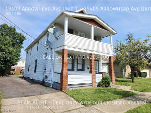
Are you ready to elevate your living experience? We have an exciting new listing that’s bound to capture your heart! Nestled in the heart of

Excitement is in the air as we unveil a new listing that could be the home you’ve been searching for! Nestled in the heart of

Embark on a journey to find your perfect home sweet home with our latest listing in the heart of South Euclid. Welcome to 4070 Wyncote

Looking for a place that combines style, convenience, and affordability? Your search ends here! We’re thrilled to unveil a fantastic new listing that could be